Overview
My Role
Problem & Solution
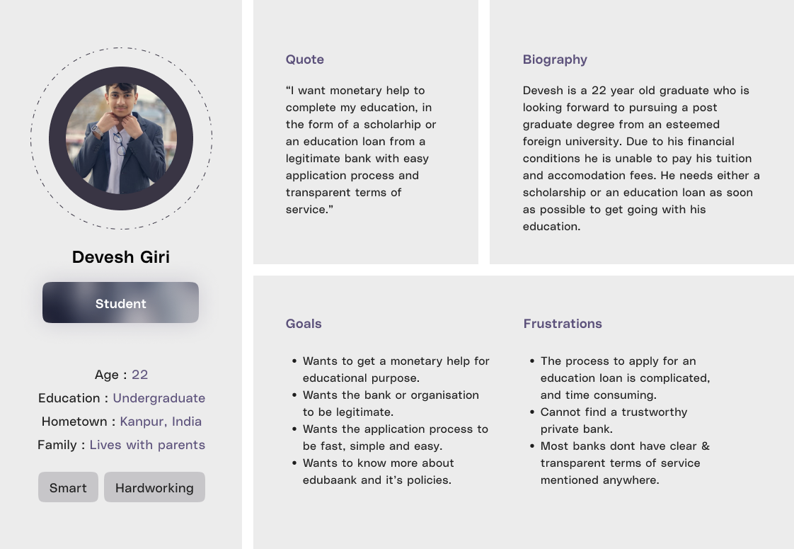
User Persona
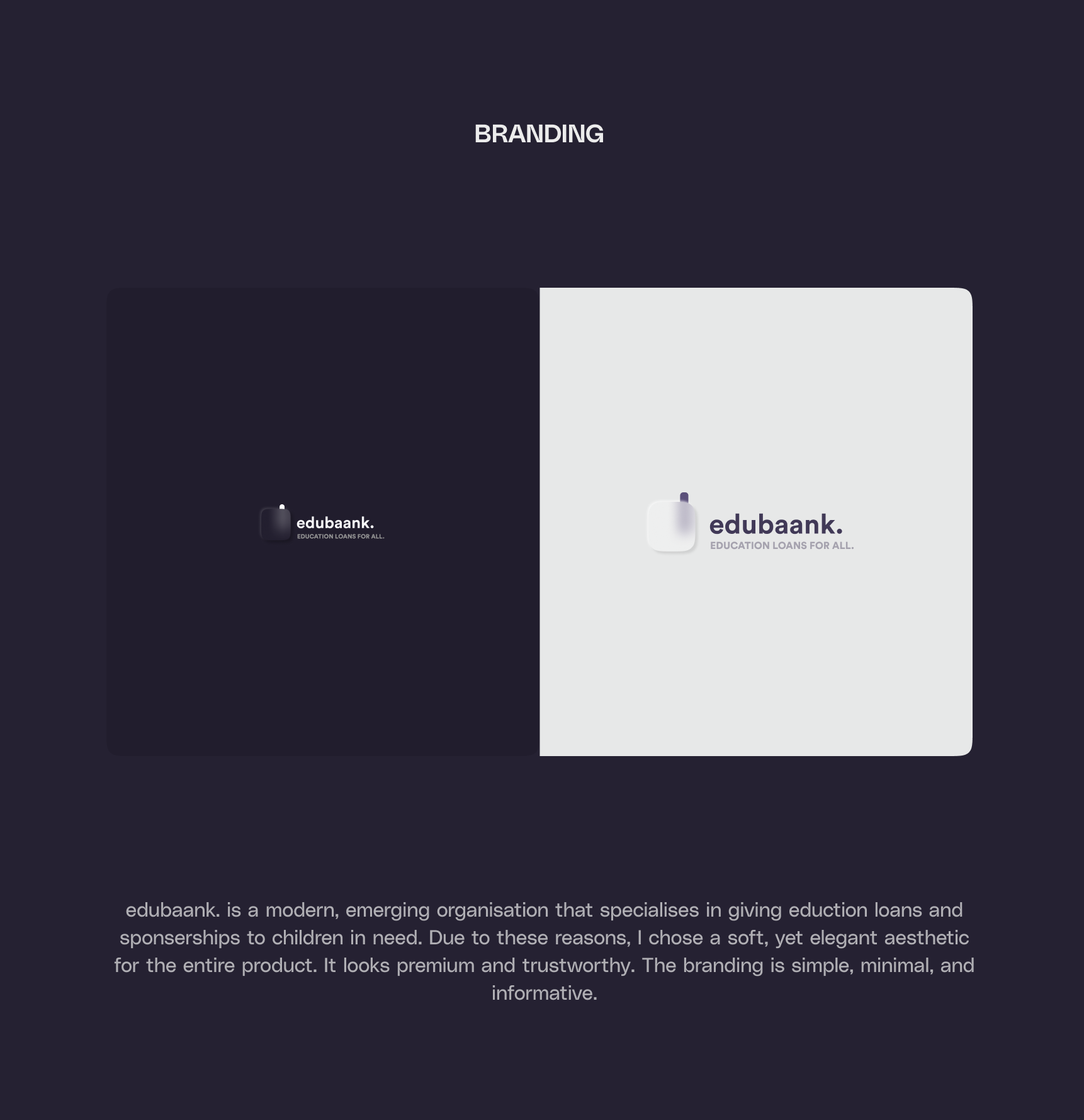
Branding
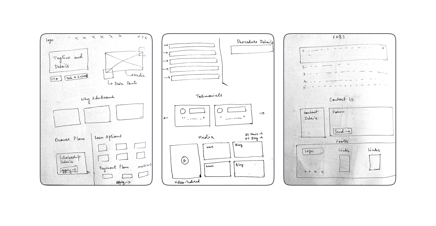
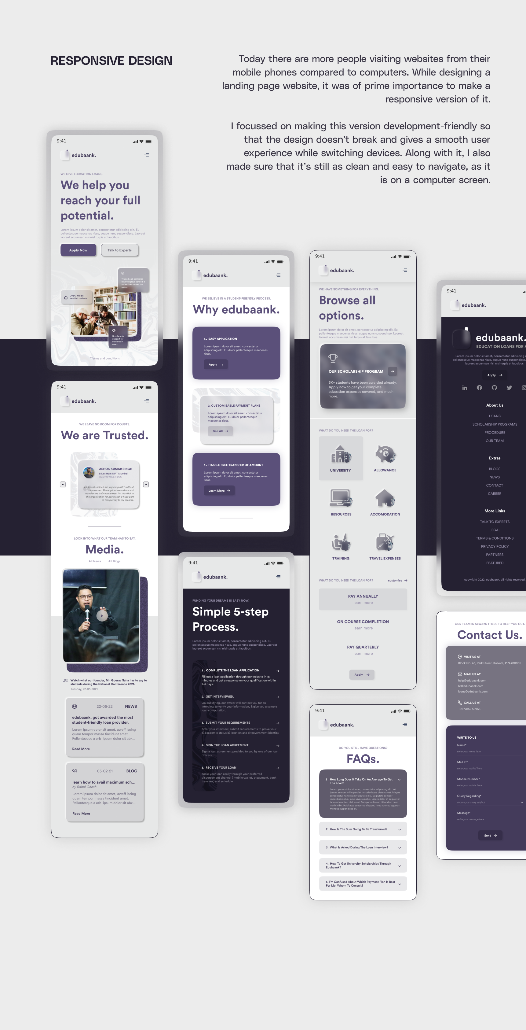
Low Fidelity Wireframes
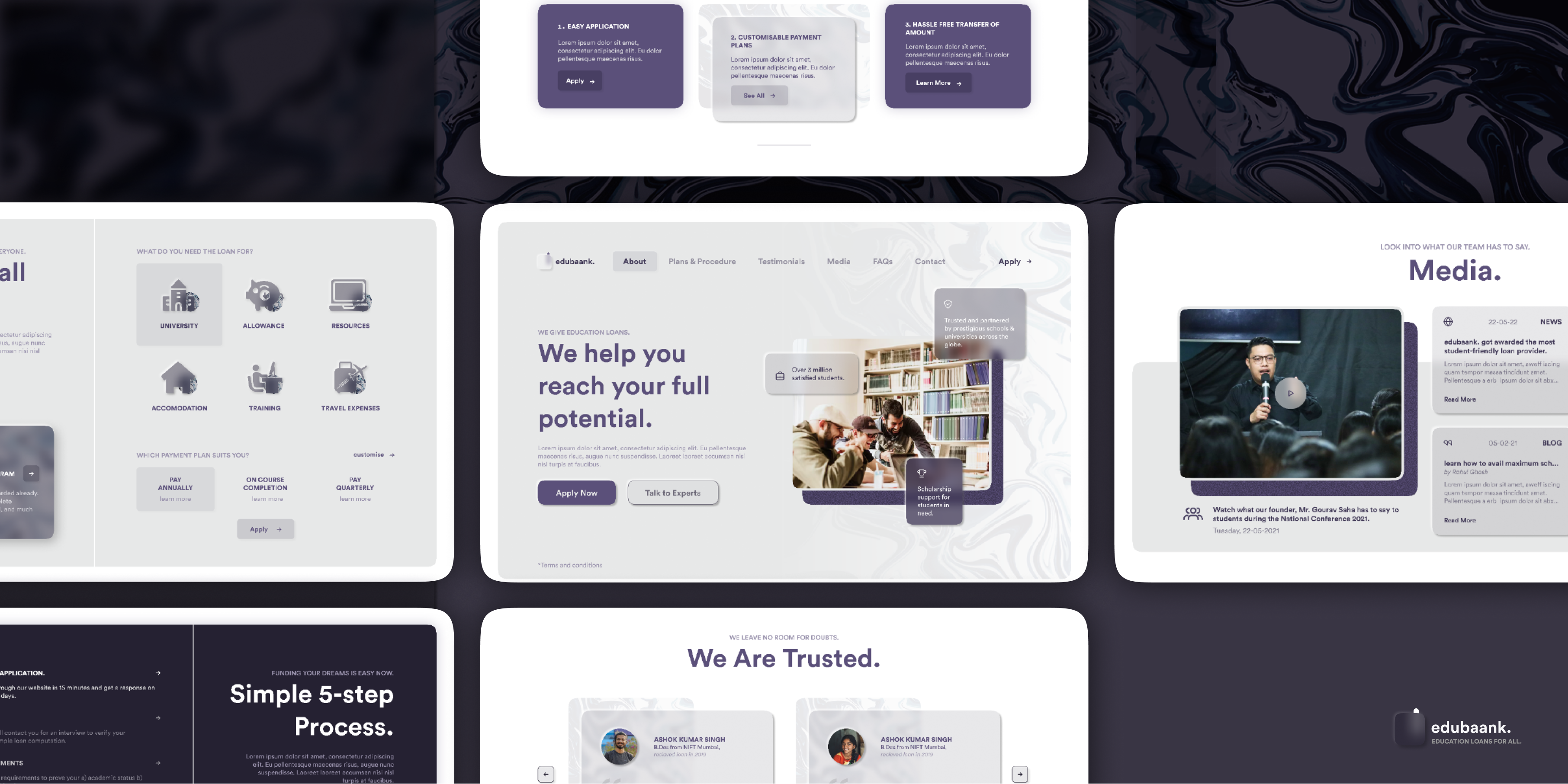
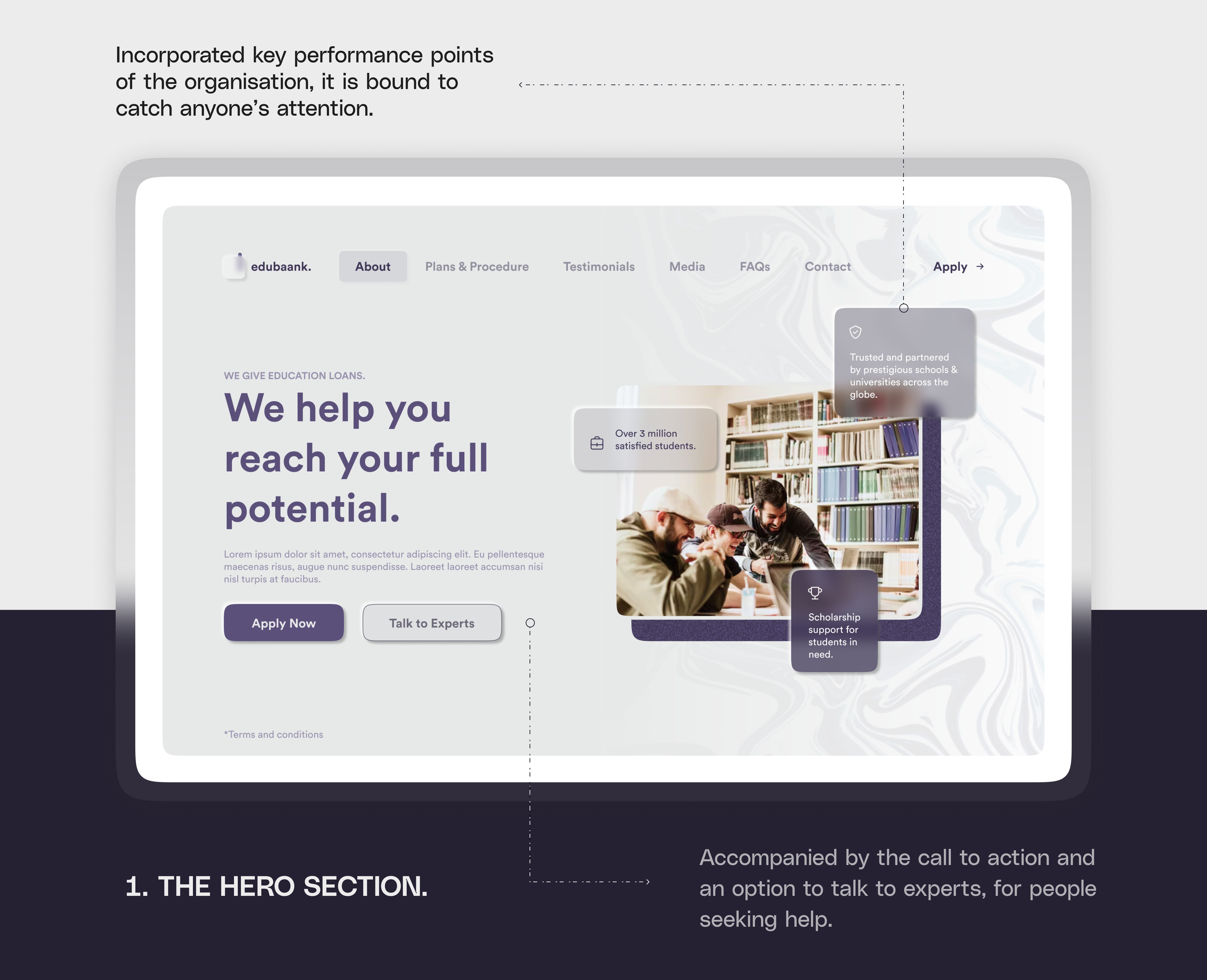
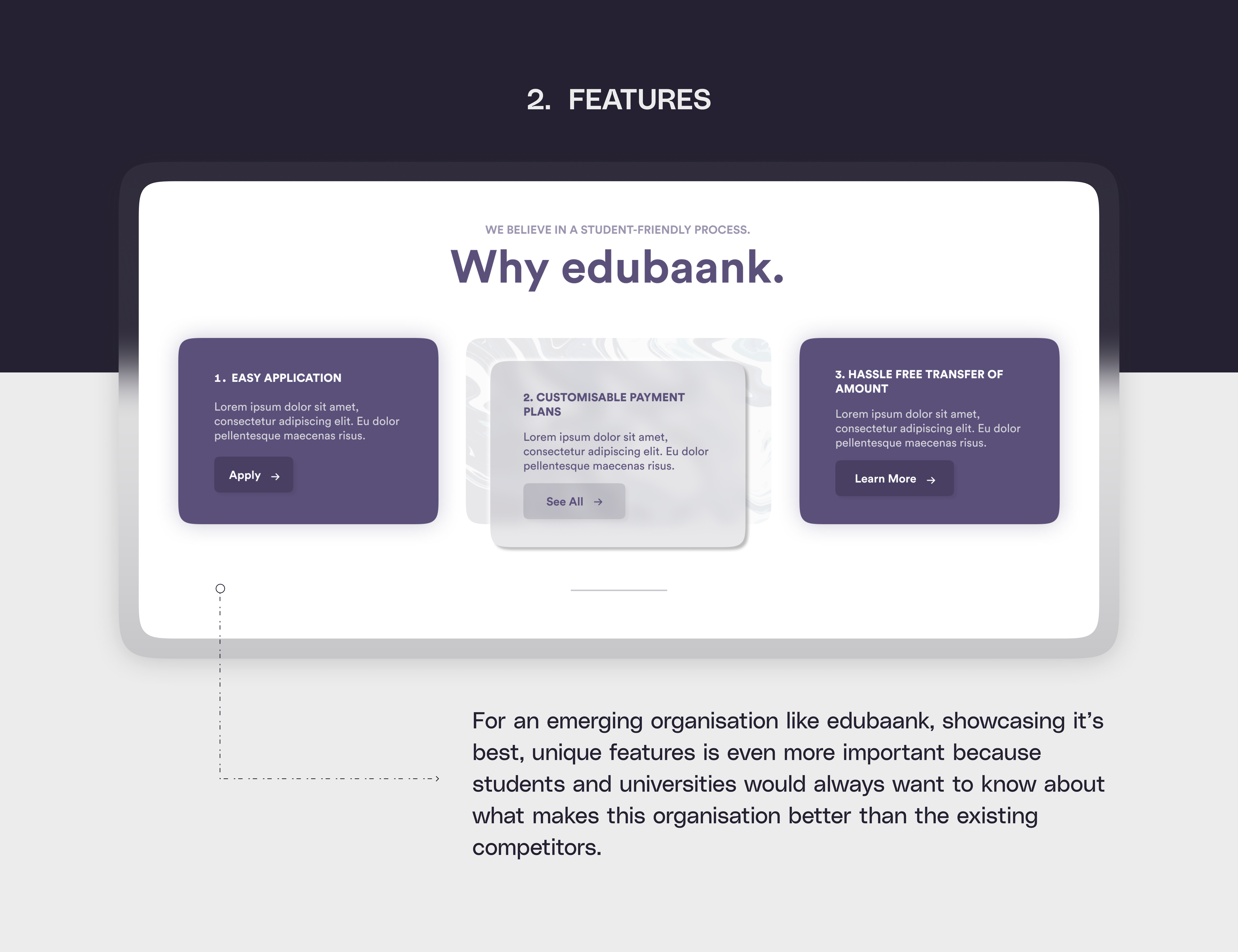
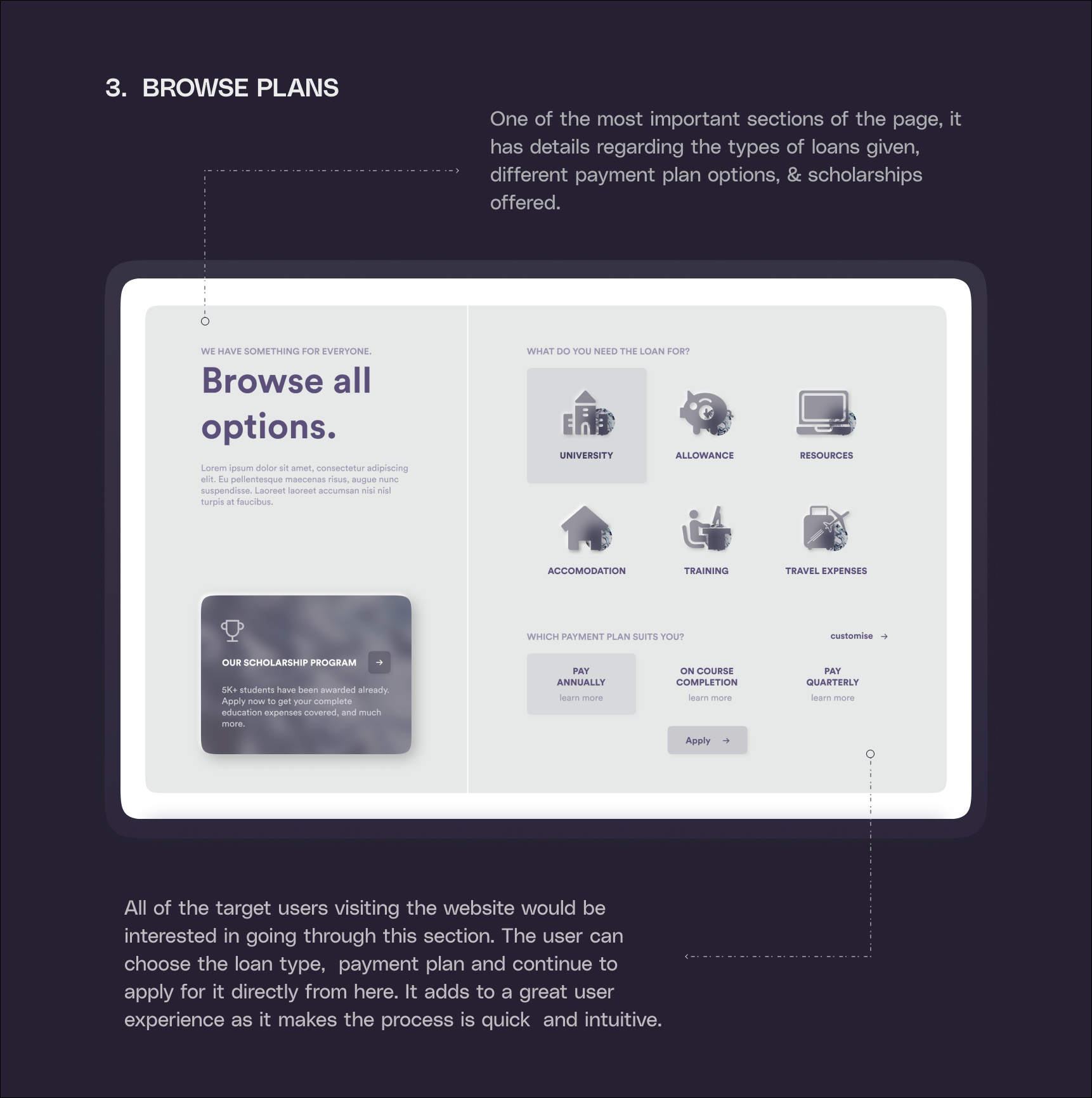
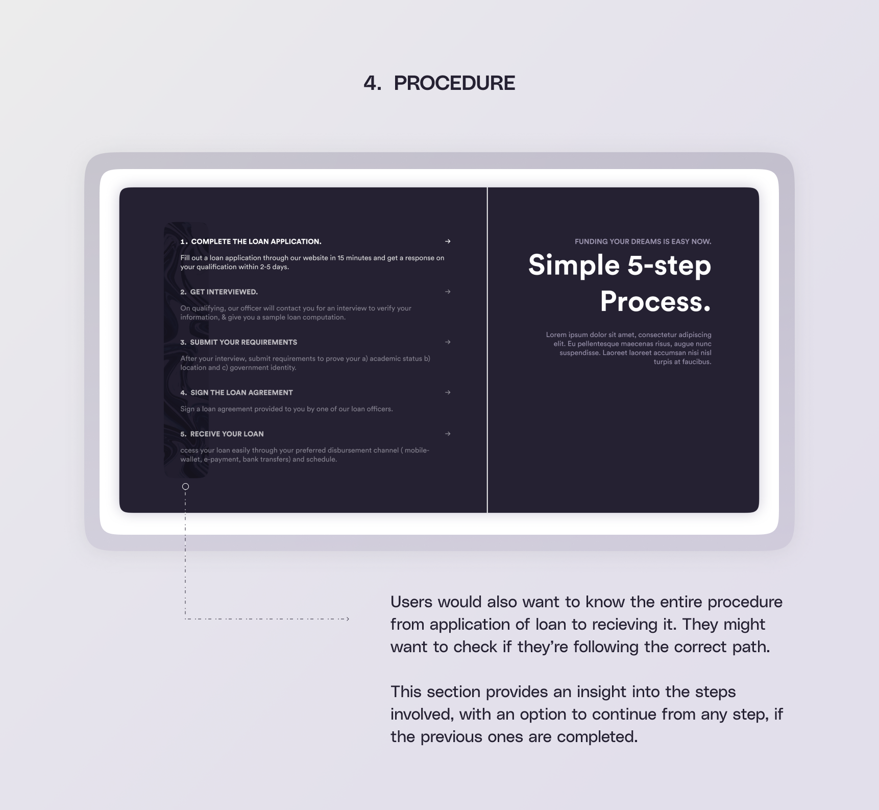
Final UI
Education Loans for everyone - Responsive Landing Page Design May '22


© 2022. designed and developed by me with 🖤